From Plate to Palette: Designing One Unforgettable Visual Story
- Sep 18, 2026
What makes an event feel truly cohesive? It’s rarely one standout element. It’s the way every detail works together to create a single visual story.
That idea was at the heart of NACE Seattle’s September event, From Plate to Palette: Designing One Unforgettable Visual Story, featuring acclaimed event professional Jaclyn “Jackie” Watson. With 16 years of experience spanning private estates and international stages, Jackie explored how thoughtful design choices can transform the way guests experience an event.
And for an evening dedicated to the power of visual storytelling, the tabletop itself became part of the lesson.
Building a Palette from the Table Up
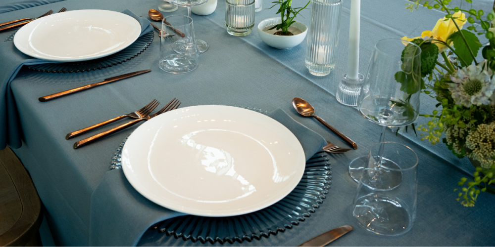
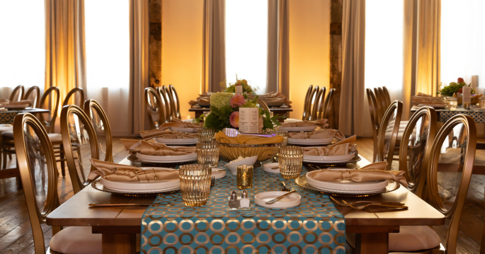
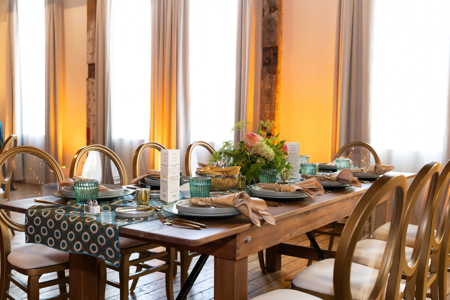
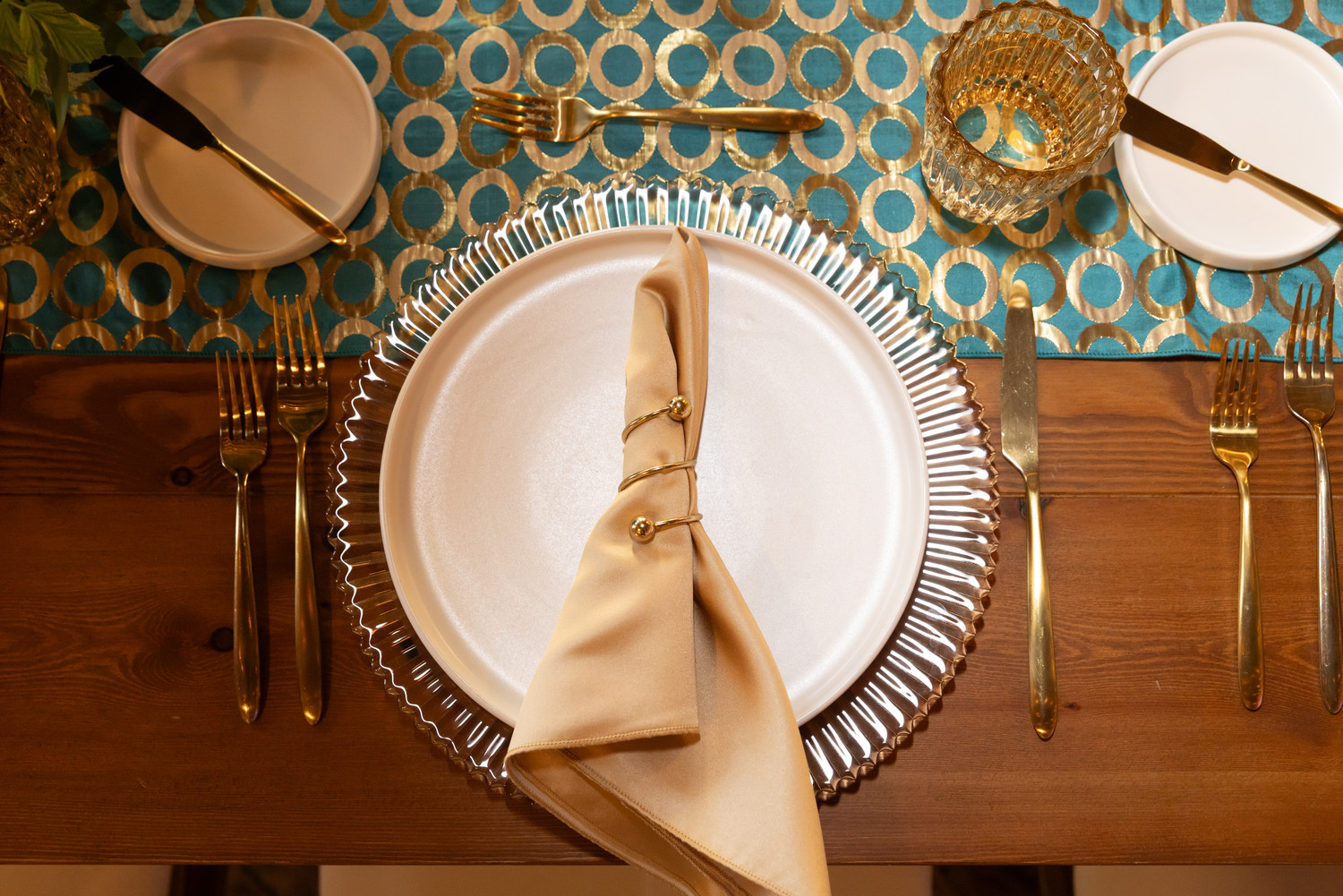
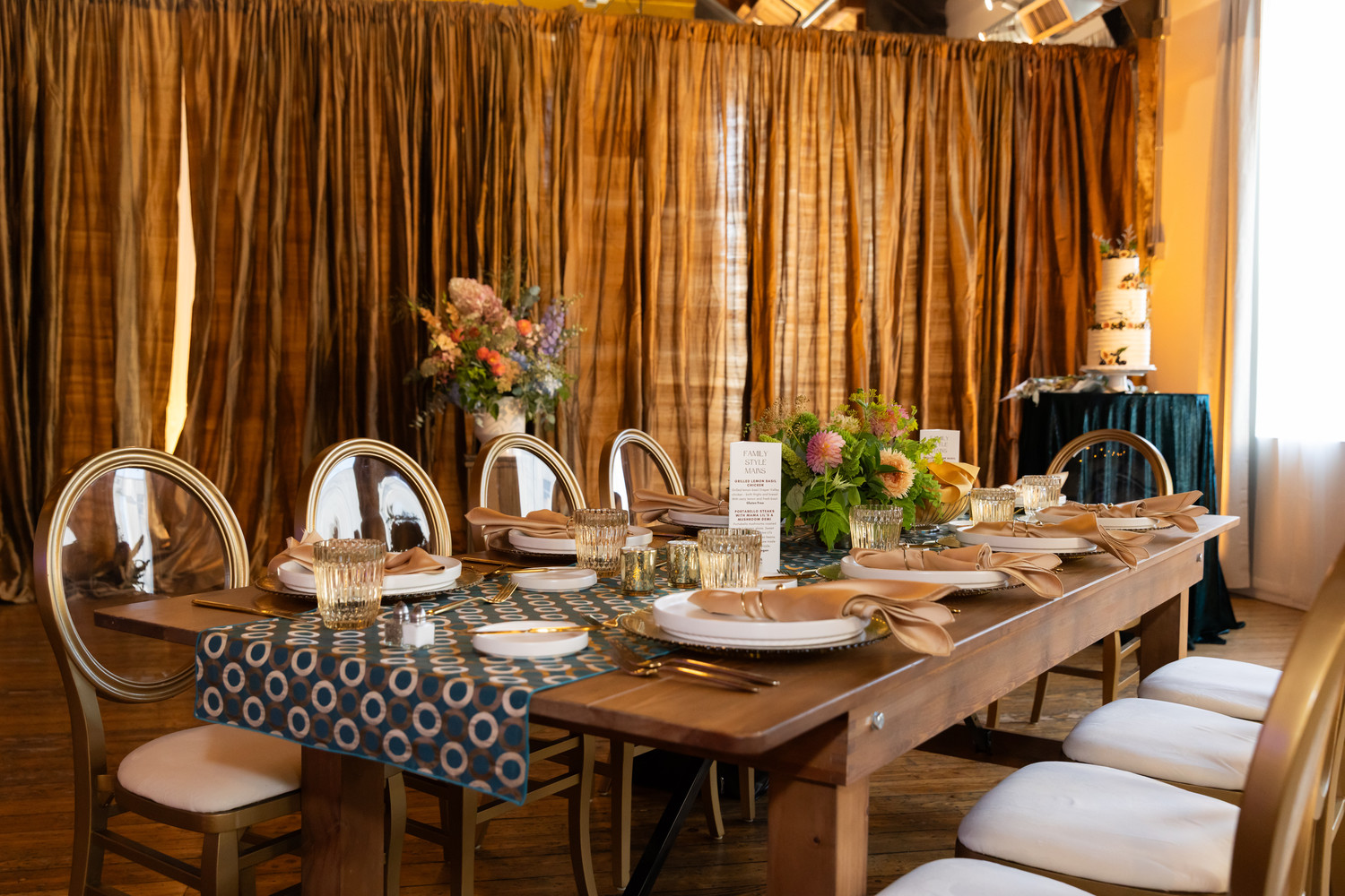
The design embraced a rich teal, gold and neutral palette, pairing bold patterns with warm metallic details and natural wood. Pedersen’s Rabanne Turquoise/Gold Runners immediately established the color story, their graphic circular pattern bringing energy and movement to the tables.
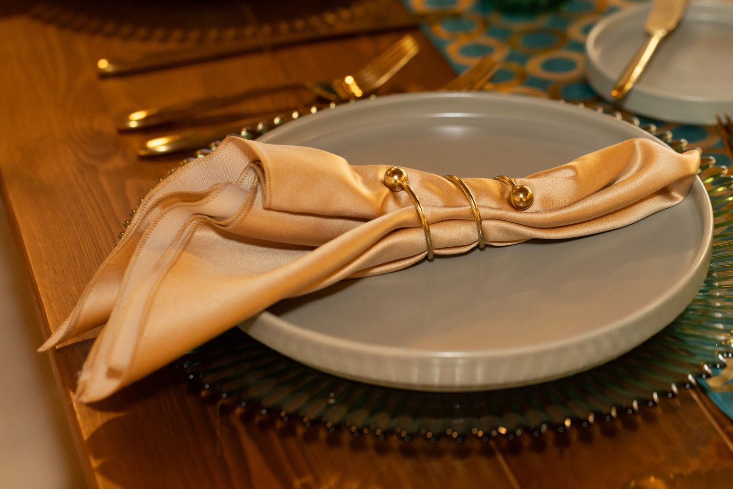
From there, layers of texture and tone carried the palette through each place setting. Halo Dinner Plates in Linen and Sage provided a clean, contemporary foundation, while sparkling Emma Glass Chargers in Ginger and Verde introduced another reflective layer beneath the stoneware. Satin Gold/Beige Napkins, gathered with Brass Spiral Napkin Rings, softened the setting and echoed the gold running throughout the design.
Velo Brush Gold Flatware completed the place settings, reinforcing the warm metallic accents without competing with the statement runner.
A Table Designed to Be Experienced
One of the central ideas behind From Plate to Palette was Jackie’s “Plate to Palette Chain”—the connection between individual design decisions and the larger guest experience.
The tablescape demonstrated exactly how that can work. Rather than treating tabletop pieces as isolated choices, the design repeated color, shape and texture from one element to the next. The circular motif of the runner was echoed in the plates and glass chargers, with gold appearing across the flatware, napkins, and napkin rings.
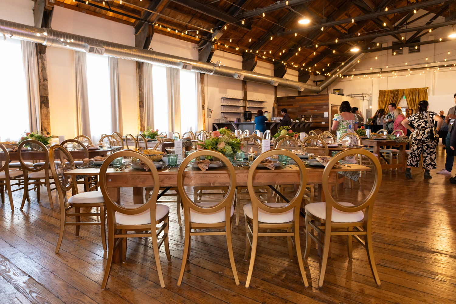
Even the seating became part of the palette. Nova Gold Chairs brought the gold tones upward into the room while their transparent backs kept the overall look light and allowed the tables to remain the visual focus.
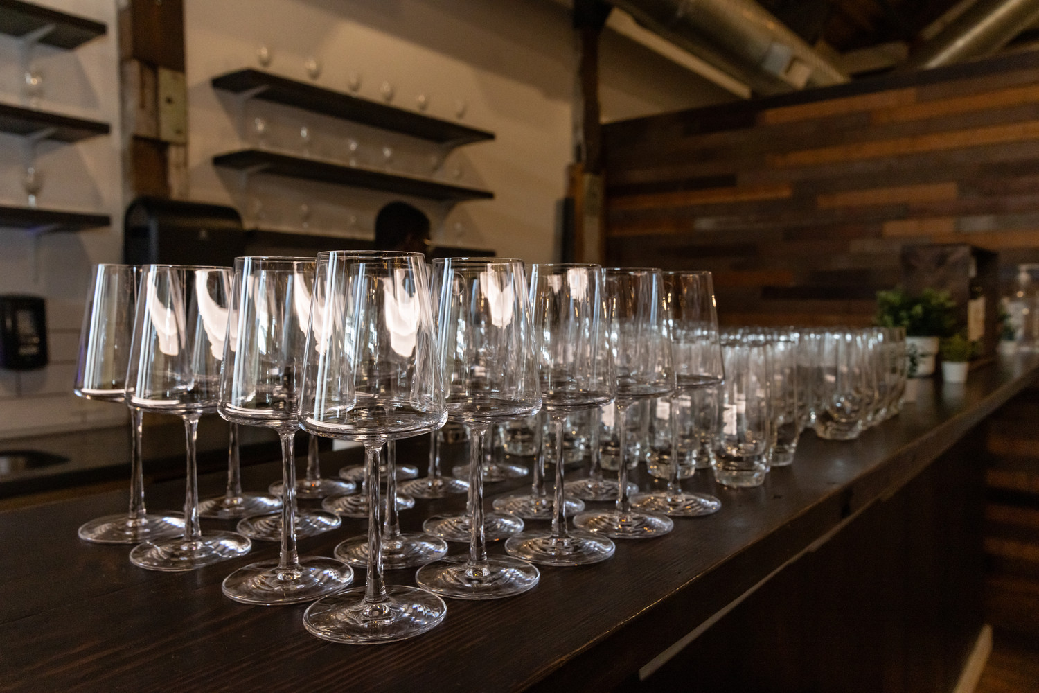
At the bar, Era White Wine Glasses, Highball Glasses and Stemless Champagne Glasses carried the experience beyond the table, showing how a cohesive approach can extend through every guest touchpoint.
Designing with Intention
Perhaps the biggest takeaway from From Plate to Palette is that memorable events don’t require every element to match. They require every element to feel intentional.
At Pedersen’s, we love seeing how event professionals use our rental collection as part of that bigger creative story. NACE Seattle’s September event was a beautiful example of how thoughtful layering, color, texture and hospitality can turn individual details into one unforgettable whole.
Featured Pedersen’s rentals included:
Creatives:
Venue: @edererhall
Speaker Hotel: @cphotelseattle
Featured Planner: @davisabota
Culinary Partner: @madreskitchen
Speaker: @jaclynwatsonevents
Rentals: @pedersenseventrentals
Wedding Cake: @artfullayerz
Photobooth: @citysoundwave
Reception Music: @the.afterparty.band
Florist: @analogfloral
Drapes: @pjhummelandco
Photographer: @jeanmarcusphoto